Dead by Daylight's Perk Management Nightmare: The Urgent Need for a Search Function in 2026
Dead by Daylight's perk selection process lacks a search function, causing frustration and hindering efficient gameplay for horror game fans.
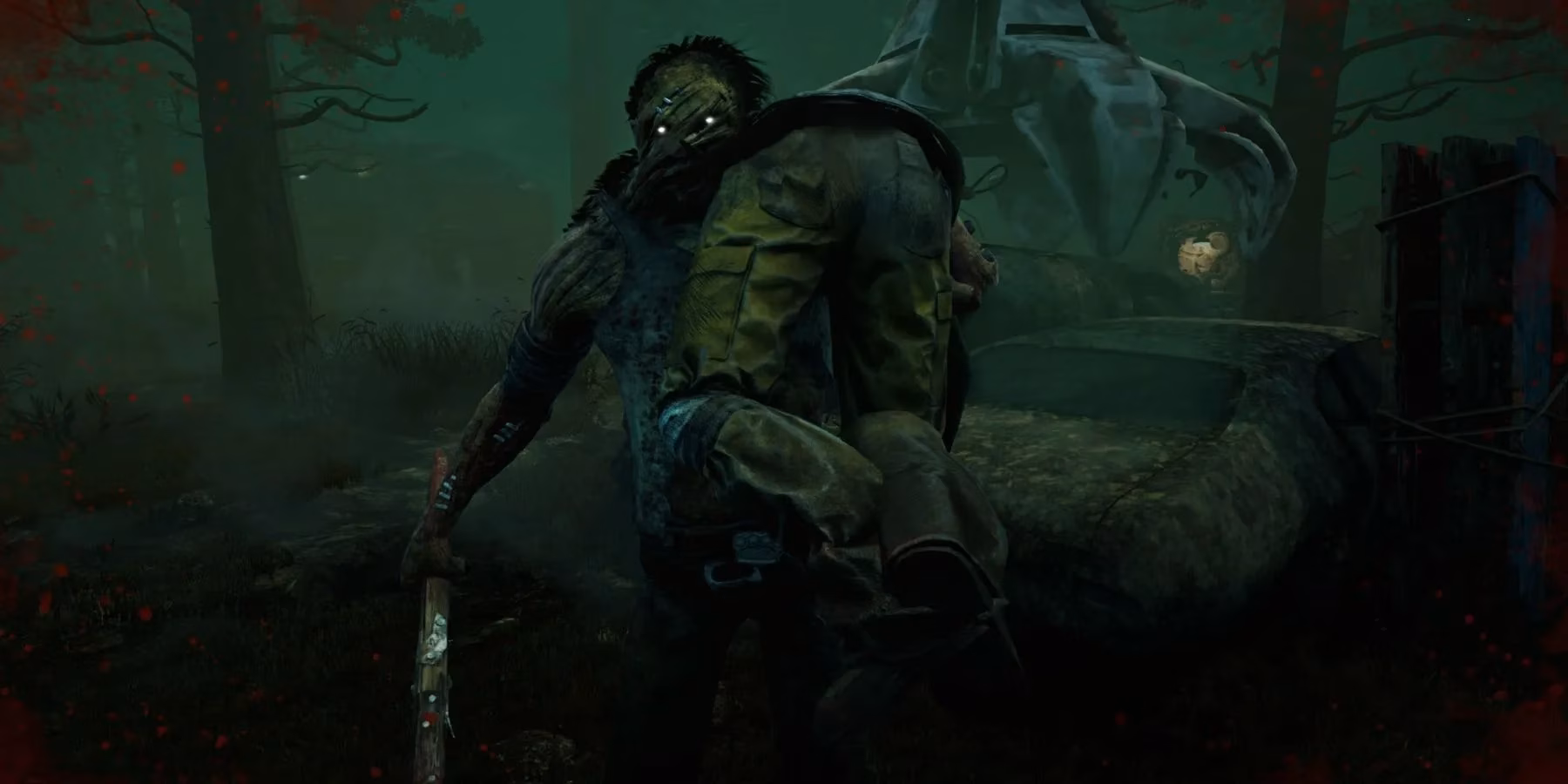
Eight years into its reign as the premier asymmetrical horror game, Dead by Daylight continues to be a wild ride for its dedicated player base. The game has evolved from its 2016 origins into a sprawling digital museum of horror, boasting collaborations with over 30 iconic franchises and introducing a staggering roster of characters. However, beneath the surface of this thrilling, pulse-pounding experience lies a persistent and growing source of frustration that has only intensified with time: the complete absence of a perk search function. As players prepare for a trial in the lobby, they are faced with a daunting task—navigating a labyrinth of over 250 unique perks, all listed alphabetically, with no way to filter or find them beyond manually scrolling and recognizing tiny icons. It’s a real head-scratcher in an age where such a basic quality-of-life feature is considered standard.
The core of the issue lies in the game's preparation phase. The Perk Selection Process has become a mini-game of memory and speed. With well over a hundred perks for both Survivors and Killers, the list is a never-ending scroll. Players must rely on visual recognition of the perk's icon or waste precious seconds hovering over each one to read its tooltip. This system, which might have been manageable in the game's infancy, has become utterly unsustainable. Imagine trying to find a specific book in a library with no Dewey Decimal System, just shelves upon shelves arranged only by the first letter of the title. That's the daily struggle for Dead by Daylight enthusiasts. The community's sentiment is clear: this isn't just a minor inconvenience; it's a significant barrier to efficient gameplay and build experimentation.
Over the years, the player base has been incredibly vocal, practically begging the devs for a simple search bar. Memes and pleas on platforms like Reddit have become a regular occurrence. One famous post by a user highlighted the absurdity with a simple image: a chaotic, packed perk screen with the caption "Find the Hex: Ruin." It perfectly captured the community's exhaustion. The suggestions from players have been plentiful and sensible:
-
A Text Search Bar: The most requested feature. Allowing players to type "Decisive," "Unbreakable," or "Pop" to instantly filter the list.
-
A Favorites/Bookmark System: Letting players tag their most-used perks and pin them to a dedicated front page for quick access.
-
Filtering by Category: Options to show only Perks related to Healing, Generator Repair, Stealth, or Chase, for example.
-
Keyword Tags: Associating perks with tags like "Exhaustion," "Totem," or "Endurance" for smarter searching.
Interestingly, Dead by Daylight Mobile has occasionally been praised for having a slightly more intuitive interface in some aspects, such as showing teammate loadouts during loading screens. This only highlights the discrepancy and the feeling that the core PC and console experience is lagging behind in basic menu functionality.
The problem is compounded by the game's relentless update schedule. With multiple new Chapters and Mid-Chapters released each year, each bringing at least six new perks, the roster grows exponentially. What was a large list in 2022 is now an overwhelming tome in 2026. Every new killer or survivor added is another handful of perks tossed into the alphabetical abyss. The developers, Behaviour Interactive, have shown a fantastic commitment to new content and collaborations—from classic slashers to original nightmares—but this core interface issue remains the game's Achilles' heel.
From a design perspective, the lack of search functionality feels like an archaic relic. It discourages players from experimenting with new perk combinations because the friction to find and equip them is too high. In the fast-paced lobby timer, many players simply default to their memorized, go-to builds rather than explore the full strategic depth the game offers. It's a classic case of feature creep outpacing user experience maintenance.
Looking ahead to the rest of 2026 and beyond, the community's hope remains. While the developers have delivered breathtaking maps, terrifying new killers, and clever survivors, the most celebrated update for many would be a simple, clean menu overhaul with a robust search and filtering system. It wouldn't require new animations or balance changes—just a profound improvement to the daily player experience. Until then, players will continue to scroll, squint, and sigh, proving that sometimes the most terrifying thing in Dead by Daylight isn't the killer chasing you, but the menu you have to navigate before the match even begins. The ball is in the developers' court to finally fix this long-standing quality-of-life issue and bring the game's interface into the modern era.